7 Web Design Principles that Will Boost Your Conversion Rate
Everyone wants to boost the conversion rate of their website. Web design is not like building an aesthetic design or pretty outlook; it should also be responsive. A web design may increase or decrease the conversion rate before considering best SEO practices. Social media lead magnets, and you have to be careful about the website design, it should be responsive. Here the responsive means drive traffic into your website and increase conversion rate.
Here we are going to discuss seven web design principles that will help you to increase conversion rate.
Seven practical web design principles need to follow to make it responsive.
Respect user’s time
In the fast-paced industry, people are incredibly impatient. Nobody wants to invest much time on a single website that is not valuable for him. According to the research study of Aberdeen Group, a one-second delay in page loading leads to a 7% reduction in conversion rate. Every second bothers when we consider webpage loading time. Therefore, the web designer should check page loading speed and troubleshoot issues. There are many tools available in the market to check whether your website pages running well with no issues, including:
- Google page speed inside
- Pingdom
- GTmetrix
- KeyCDN
- Sucuri
Utilize negative space
Negative space is not negative for your website. It is a positive thing in your web design. Without negative space, your website would be unusable and not consumable.
Negative space means:
- The vacant space between the larger elements of your page,
- Space between headlines and content,
- Space between sidebar and content,
- Space between two paragraphs,
- Space between lines of text, space between two words.
Pay attention to all kinds of negative space on your website, and make it more scannable and legible. The Negative space help audience to scan your website quickly. It is very important because this is the actual way people read a website. When people scan your website more, you will get a high conversion rate. Many big websites use a significant amount of negative space to keep the website focused and make the call to action more noticeable.
Follow F Layout
Users follow the “F” pattern when they scan or read a website. The audience read from left to right at the top of the screen. Then they read the webpage downward to get an overall idea of the content. The bottom right area of the web page is the least visible part of your website. You can take advantage of user’s behavior by placing crucial information, elements, and call-to-action in higher visibility areas. i.e., Top left. And identify less important elements in the lower visibility area, i.e., bottom right.
Colour of the web design matters
The Colour of the website outlook is the most underestimated aspect in web design. Still, it plays a crucial role in driving traffic to your website and changing the website’s overall mood. Different colors are associated with other emotions and purposes. So, design without Colour is incomplete. So, it is essential to select a color scheme for your website that reflects the sense that you want to make about your brand.
Contrast
Apply contrast to keep headlines, content text, call to action buttons readable and easily noticeable. On the other hand, your font and button colors should clearly contrast with the background color. For example, you can contrast the black text with white background.
If you want to highlight a button, then it should be a completely different color from the rest of your website.
The professional web designer should know the perfect color scheme before building a business website. The contrast will help you to specially emphasize the essential elements.
Keep your design simple
Follow the rule “keep it simple” in web design. It is the essential web design principle. Professional web designer follows it as a simple rule to create a website as straightforward as possible because simplicity and authenticity are highly important when driving conversions. Simple and responsive websites are eye-soothing, easy to scan, and motivates the audience to take action. Here simplicity refers to a clean overall web design that minimizes distractions and clutters.
If you observe human behaviour, then you may realize people don’t like to consume too much information at a time, so if your audience gets too much staff in a single webpage, they will get confused and puzzled. So, create your web pages with limited information, avoid unnecessary information that may confuse your audience. Remember high confusion leads to an increased bounce rate.
Implement the eight-second rule
The first eight-second is important, and you will get a tiny scope of opportunity to engage an audience when they come into your landing page or the website. So, utilize those seconds wisely.
- Use large catchy headlines that offer a clear idea about next content
- Use relevant images to convey the main points of your business. Encourage audience for call to action
- Make all-important button clear, simple, and large
- Make your content engaging
- Add relevant video, audio
There are some tips from digital marketing company India to grab users’ attention and boost conversion within the first eight-second to 15 seconds.
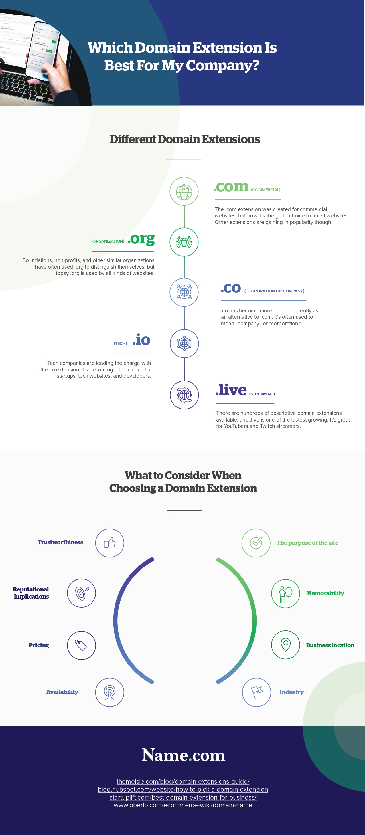
Infographic Created By Name.com, Best Place To Buy IO Domain For Your Website

